Category: Assignment #4

  • Assignment #4 Q3

    3. Question 3

    Visit the St. Clair College website. Analyze it strictly from a visual marketing strategy perspective targeting: Local domestic high school students. You are to provide three strategic visual enhancement recommendations. For each recommendation:

    a) Clearly identify the issue or missed opportunity (3 x 2 = 6 Marks)

    b) Propose a specific visual improvement (3 x 2 = 6 Marks)

    c) Explain why it would improve recruitment effectiveness (3 x 2 = 6 Marks)

    d) Connect it to student psychology and digital behaviour (3 x 2 = 6 Marks)

    Do not provide vague suggestions like:

    • “Add more pictures”

    • “Make it more modern”

    • “Use better graphics”You need to be specific based on class content only:

    • What type of visuals?

    • Where?

    • Why?

    • What behavioural outcome would it influence?

    Think like a digital strategist. (24 Marks Total)

    1. Strategic visual enhancement recommendation 
    1. The first issue I found on the homepage main section, is that they are not mainly targeting local or domestic high school students in a visual way. There is not much that would be appealing to high school students right away from just looking at the visuals on the homepage. The main visual on the st clairs official website focuses on st clair programs like trades and what the school offers rather than how students impressions or stories or representations of St. Clair. College is. This might be an issue because first impressions, especially for people looking to enroll or current high school students, matter a lot and they can be made in less than a second. It doesn’t represent much emotionally or relatable to high school students at first glance, this can lead to them not finding a connection or an interest towards the website. 
    2. A specific visual improvement that can be done and solve this problem is adding a slide show or a short video of students enrolled in St.Clair on campus, either studying, being in a class that would be intriguing to some and expressing some kind of emotions, preferably them smiling, talking to friends or collaborating with peers. This visual representation can be followed by small text like a heading and/or a call-to-action message that would tell the target audience to either find out more, or explore programs. 
    3. This improves requirement effectiveness because it gives St.Clair College a fresh look, targeting high school students. It goes from information and clear statements about the college to giving it an identity, how a student would look or how they are in this environment and college. High-school students can be picky when choosing their college or future education, which is why the main homepage visual should reflect on how the outcome of being in st clair college looks rather than just what it has to offer. This reflects more on emotion and showing that this college is a great environment to be in which will catch a lot of attention.
    4. This change would connect with student psychology and digital behavior because high school students are fast to make a decision when clicking or looking at a website because they have a short attention span. Visuals of the college and students that express different emotions, showing how it looks like to be a student there would be appealing to them and is a great visual strategy because it stops them from scrolling and losing interest, it makes them wonder or be attracted int becoming a student at St.Clair and it makes them act emotionally, if the people look confident and happy this will make them feel at peace and believe that this would be them if they joined St.Clair College.

    2. Strategic visual enhancement recommendation 

    1. When clicking on the “our programs” page, I noticed that there is barely any visual and it is focused on mostly text and a list of all the programs this college offers. This puts viewers in a spot where they have to focus on the information, without having anything visually appealing or any visuals guiding them into what programs they might be interested in. This is another issue especially that the target audience is local high-school students, because this audience is focused on learning visually, have a short attention span meaning they scan through information and do not read a lot, it can also seem overwhelming or too simple.
    2. A visual improvement this section would require is instead of every program just being stated, only the names, it would be better to add a visual to each that is larger than the name, and focuses on either how the program looks like, the graduates or some activities and appealing classes that might stick out to this audience. This allows viewers to portray these programs by the visuals they see above the program titles, and make a decision either to find out more or look at others that might catch their attention. 
    3. This change improves requirement effectiveness targeted to high-school students because they will look at the programs at their next steps, it will make them want to be in it or have a strong interpretation and first impression about it, not just a list of programs. Students have the opportunity to compare these programs visually not just by reading about them, and choose their top ones they found interest in, leading them to make a final decision. Visuals improve comprehension and retention, and are crucial to a website, especially if you are trying to get viewers to act on what they see, these kind of visuals will make students understand more about the offered programs, making them feel better and more confident about choosing a program and their future along with speeding up the application process because it makes them sure and assertive about the program that will shape their future. 
    4. The visuals for the programs page is tied with Student Psychology & Digital Behavior because first, it motivates them to choose a program by the visuals. It is easier for them to scan and analyze the content just by looking at small text and visual images and also makes them think that this is how they could be in the future if they join this or this is the lifestyle and environment that fits perfectly with me and my lifestyle. They visualize their future selves and this is very important because picking a college is a lot of pressure and takes a lot of time, research and thinking to make a final decision. 

    3.  Strategic visual enhancement recommendation 

    1. Another issue I found in the St.Clair College website is that there is too much happening visually at once on most pages including the homepage. There are visuals and text and news and articles. A lot of sections trying to catch people’s attention, a lot of buttons, blocks and links and generally just content trying to overlap each other, which looks disorganized visually and there is space for improvements. Users can have a hard time knowing where to look first or what to click on first unless they have a certain reason why.  This can be overwhelming to high school students that do not have a lot of knowledge of websites with a lot of buttons and content they could find it harder to navigate.
    2. A visual improvement that could solve this problem is reducing some buttons and content, making it look more organized and in place without students feeling overwhelmed or thinking that there is too much going on. I would focus on one main point per section and carefully choose visuals to match each other or that lead to one another to avoid misinterpreting. I would also leave space for background color, like white in this case and have less call to actions and headings on one page.
    3. This improves requirement effectiveness because it keeps people, especially high-school students engaged with the website, avoids stacked text or overwhelming information and makes it easier to comprehend and understand the main points just by taking a glance not having to read all the content and information included. This can also improve CTR’s and the time people spend on the website mainly on a page and conversion rates as well, people applying to the college or viewing it more often or interacting more with it.  Instead of students being stuck and not knowing what to do next, the website will just lead them into wherever they want to know about St.Clair.
    4. When it comes to Student Psychology and Digital Behavior, students tend to have shorter attention spans, they would rather click on a fast loading, easy to navigate and visually appealing website than one too overwhelming or not having enough images. Students might be confused, lost, lose interest or scroll/leave the website if those things are not met because these are the things they value the most in a website. Following an F-pattern, they avoid putting a lot of effort especially digitally and it takes a longer time for them to process too much or not appealing information. 

    Total : 50 Marks

  • Assignment #4 Q2 b

    Question 2b (8 Marks)

    Explain in detail how the image(s) strengthens the post from a digital marketing perspective.

    You may reference:

    • Attention economy

    • Scroll behavior

    • Visual hierarchy

    • Brand perception

    • Trust building

    • Emotional triggers

    • Information processing

    • Conversion influence

    Be analytical. This is not a design reflection. This is marketing reasoning.

    From a digital marketing perspective, these images strengthen the post in several ways. First, when it comes to attention economy and scroll behaviors, the first image is meant to capture attention, making viewers stop scrolling and grab their attention. The main image represents a woman at work or about to go to work, looking at her watch evoking emotions like stress and she is rushing. In this digital marketing world, people usually scan through the content and engage more often with content that grabs their attention faster, which is what the first image is meant to do. People will find it relatable, it will strike emotions and want to find out more about it which will make them keep scrolling. This image will be effective because just by looking at it, it can relate to a lot of people and also solve problems. This visual post also encourages scrolling which increases both time and them more likely to interact with it and have an interest in the business. When it comes to visual hierarchy, instead of just having plain text, or the biggest part of the post being text, the visuals by themselves express a story without having to even read anything, but they are also being backed up by headings and small descriptions for marketing Vending Glow. The 4 images all tell a story, the main point is to lead people into purchasing from Vending Glow, it is trying to relate to people’s busy and stressful lifestyles while also trying to get the main point across. The post goes from Ana being stressed and in a rush, to finding the vending glow and purchasing the product in this case being a lipstick she forgot or was looking for, to using it and finally being happy and feeling confident. This makes people understand what Vending Glow offers and what problems it can solve, which will benefit them, just by scanning through the post following the F-pattern. The visuals also determine brand perception and build trust in many ways, first by using images women and students and people with jobs can relate to in a real life scenario the woman rushing or being late for work. This gives Vending Glow a sense of authenticity, this is a strong benefit because high-quality and relevant images express quality, credibility and trust unlike visuals that do not relate in many ways to the target audience,or feel forced or not interesting or reliable. This post makes it as real as possible, relating to its audience and not having “too good to be true” visuals. Another reason why this image strengthens the post itself is because it triggers emotional responses. This is an important factor to consider when creating the posts in order to influence consumer behavior, how to get rid of stress and turn it into confidence and a smile, this triggers people’s emotions and leaves them space to engage and connect with the post. If a person relates emotionally to a post or story, they are more likely to look more into it and eventually make a purchase or keep it in mind for when they are in a situation like that as well. Moving on to the image processing and conversion influence, users retain 65% of information that include images and only 10-20% retain the text (w9-c-importance of visuals). The final image, which is the girl at her workplace, feeling confident and happy. These images make it simple for the message to be processed just by taking a glance. People’s attention spans are not high and this makes users understand the message fast and know what the end results and solutions are to this specific problem lots of us have. The images themselves also get across the Vending Glow’s CTA message which is glow-on-the-go, getting viewers to eventually try the machines, be on page with the business and getting them to take action. This does not make anyone feel pressured to purchase from Vending Glow however it does show clearly the benefits that can come from the vending machines. These images are all strategically placed, they are not there for only design or decor, and they are meant to catch attention, strike emotions, relate, build trust, educate and guide people to purchase. 

  • Assignment #4 Q2 a

    Question 2a (8 Marks)

    Why did you choose the specific image(s)?

    Your explanation must include:

    a) Business relevance

    b) Target audience alignment

    c) Image intent

    d) Why this visual works better than alternative visual approaches

    Based on the assignment’s requirements, I chose these specific images/screenshots I found on google for being able to tell a story. First the images even without the text express a story. They show a woman in a rush, looking stressed and looking at her watch because she is either late or forgot something and checking if she has time, both are good interpretations. The second image is the woman finding a Vending Glow machine on the way and purchasing something from it, telling readers that she might’ve found what she was looking for or what was stressed about in that vending machine. The third image is a woman using makeup and already looking happier. And the last image represents a woman with a  big smile, working on her laptop feeling happy and confident. 

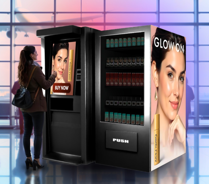
    1. These images are relevant to my vending glow business because it expresses how these vending machines automatically relieve stress, make people feel confident and on-time because it only takes a few seconds to purchase from the machines without talking to anyone or having to wait in a line or for a cashier. The first image shows the woman having no time to do her makeup or forgetting something which is the pain point. The second is a solution being found by her finding the vending machine full of beauty supplies. The third expresses the woman using the product(s) she purchased, already looking happier and pleased. Finally the last image expresses the outcome of the situation by the woman working, smiling and feeling better. This represents Vending Glow by showing exactly what the business is meant for by just taking a look at the visuals. Posts with visuals make a big impact and are very important because posts with engaging and relevant pictures get 94 % more visits and engagement and 60% more likely to click on a business or website if the images appear in search results and resonate with them. (W9-D-Enhancing Content). People make an impression on a business or web page in just 50 milliseconds (the power of visuals in web content overview) , so this visual representation is perfect because it portrays what the business does and what problem it can solve for users. 
    2. The visual post created aligns with a big chunk Vending Glow’s target audience which are busy individuals, young adults who work either at their first jobs or close to being done post-secondary school meaning they are either college or university students. These people value their time, because they have busy lifestyles, and always on the go and quick services are time-saving and help their lifestyles a lot. Young adults are also more likely to be visual learners and part of the 65% of people, they also value high-quality and self-explanatory images and this also increases engagement becoming very relevant to viewers. 67% of consumers stated that clear images matter way more than product descriptions (The power of visuals in web content overview), proving once again why high-quality, relevant posts like these represent real scenarios in real time and a real woman using existing products that people, especially this audience, deal with on a daily basis, making it stand out and relate with Vending Glow’s target audience.
    3. The intent of these images and this entire visual post is to communicate a problem, state the solution and express how to overcome it just by looking at the visuals. Linking visuals with short descriptive messages makes it more likely for people to remember it long-term, storing it into the brain easier.  The visuals also strike emotions especially for women that deal with situations like these all the time, where we forgot something at home and are running late for school and work. Even if the text and descriptions were removed from the post, the visuals will remain self-explanatory and resonate with people. Images are processed 60 000x faster than text (The power of visuals in web content overview) , along with them also triggering emotional responses because the same part of a human brain handles visuals, emotions and memory. (The power of visuals in web content overview) Showing the images with the woman, in this case being Ana she goes from stressed/overstimulated to happy and confident. 
    4. This approach works better than alternatives in a few ways. First, it gives urgency and shows the benefits from using these vending machines. A plain text without much context or clear visuals that do not tell a story will most likely be ignored or not relevant to people. Users remember only 10-20% of written text after 3 days but a whole 65% is remembered if the post has clear high-quality visuals (w9-c-importance of visuals). Another alternative would be videos however this visual post is better because 53 % of mobile users (The power of visuals in web content overview) , this also is my target audience because young adults are mostly on their phones, they tend to abandon a page if it takes more than a few seconds to load. This post does not take long at all, maybe milliseconds to load making it efficient, triggering emotions, something that a page full of text would not be able to do as well.  These images tell a story, making people relate to it, understand it clearly and finally get them to engage and purchase from Vending Glow. This approach is persuasive, more memorable, striking emotions and making it engaging and relatable. 
  • Assignment #4 Q2

    2. Question 2

    This is a multi-part question. Please create a visual post for your blog on a topic specific to your business and answer the questions below. You will create a visual-first blog post for your business website. This involves critical thinking. What is important to your business and visitors? This is not a written article with an image added. This must be:

    • Image-led

    • Message-driven

    • Minimal text

    • Strategically intentional

    The image(s) must carry the meaning. You may use:

    • Photography

    • Original graphics

    • Screenshots

    • Edited visuals

    • Multi-image carousel format

    • Before/after comparison

    • Visual storytelling sequence

    • Etc.

    The key requirement – If the text was removed, the visual would still communicate the core message.

    Please pay attention to what was discussed in class. Ensure that you include a link to the blog post in your answer. Do not forget that this needs to be included in your hardcopy. I am marking what you hand in with your hardcopy but also need to see the digital version on your blog. If it is not online for me to view (in addition to the hardcopy), I cannot mark this question. (4 Marks)

    You must:

    • Include the visual post in your hardcopy.

    • Publish the post on your blog under a category titled “Assignment 4”

    • Include the direct URL in your hardcopy

    • Ensure your blog navigation is working and accessible 

      “Glow-On-The-Go”


    Running late for work?

    Ana is stressed and late for work, caught in the morning rush, and forgot her lipstick at home.

    Stop and Glow

    On her way, she spotted a Vending Glow beauty machine, and noticed her favourite lipstick on one of the shelves.

    Anytime and Anywhere 

    Without hesitation, she purchases the lipstick in just a few seconds, and touches up her makeup.

    Ready in No Time

    Ana is now confident, walking into work feeling her best.

  • Assignment #4 Q1

    1. Question 1

    Visuals are not decoration. They are communication tools. Provide three strategic reasons why visuals are

    essential to effective web content. For each reason:

    • Clearly explain the concept

    • Provide a real-world example (not generic statements)

    Marks are awarded for depth, not surface-level answers. (6 Marks)

    1. Visuals capture attention faster than text, they are not just decorations, they are important communication tools and people are more likely to pay attention and comprehend information better with visuals rather than just plain text. Based on class notes (w9- the power of visual content) 90% of information transmitted to the brain is visual, 40% of people will respond better to visuals rather than plain text, this proves how much of an impact visuals have especially on website content. This makes visual affective and a primary form of communication online. When users enter a website, the first eye catching thing is visuals, this helps them tie what they see to what they read making them more likely to stay on the website for longer, raise an interest towards the content and act based on it. On (w9-C-Importance of Visuals) our eyes can register around 36,000 visual messages per hour and people can understand a scene in less than 1/10 of a second. The human brain can process images 60.000x faster than plain simple text. 

    Example:

    On the Airbnb’s website, most of the content found is people displaying images of their apartments and condos, or living spaces and the images are appealing and bigger than the text, and the text on the home page is usually small, stating the name or the place where they are located and the price very small under. People go on the app to look for places where they can stay when traveling, navigating and finding one that suits them perfectly. This is a perfect example of why visuals capture attention a lot faster than text because users and people clicking on the app will understand the service in just a few milliseconds, and process exactly what they need in no time. This is way more effective than just plain text, because people judge based on looks when it comes to houses and living spaces, and if they see a place they like, they are more likely to click on it and find out more rather than just reading what the place is right away without any visuals. 

    1. Visuals improve long-term memory and make it easier for people to comprehend. Humans learn best through visuals and find it easier to remember and comprehend things when looking at visual information. This is not just a fact, it is proven by sources that 65% of people are more likely to learn better through visual information (W9-C Importance Of Visuals). Dr.Lynell Burmark says that unless the words are hooked into an image, they will go in one ear and go out the other ear, and images go directly into long-term memory unlike words that just go into short-term memory. Personally speaking, I am a visual learner myself and when I open websites or content that have images, I will more likely remember what it was about keeping the visual representation in my head and when I remember the image, I will remember some of the content behind it as well. Only 10 or 20 % of content and plain information is retained by people but 65%  is retained when the content is actually paired with visuals.   (W9-C Importance Of Visuals and The Power of Visuals in Web Content).

    Example: A great example of web content and how visuals improve long-term memory making it easier to comprehend information is Canada’s national public broadcaster and major cultural institution cbc.ca . This website delivers content and information happening in Canada, about culture, news, sports and entertainment, they usually use infographics, images and charts to strike people’s attention and for them to recognize what the article will be about and people can decide from there if they want to click on it and learn more. These visuals are the biggest part of the main content when clicking on the cbc website, followed by intriguing headlines and sometimes a little bit of the main points in the article. When viewers and readers see this, they will quickly gasp and understand what the article is about and if they find any interest they will read and remember it. When people usually read articles, the visual is the main source catching their attention, after reading they will remember the main points and talk about it with friends and family, even share it on social media if it sticks with them. Visuals break down into meaningful patterns which is why cbc is a perfect example for how visual helps remember and comprehend content. 

    1. Visuals impact decisions and strike emotions a lot more and in many ways compared to text or only simple content. The media temporal love processes both visual memory and emotions, meaning that images can be stronger and faster than words (w9-c-importance of visuals). When people look at an image that can be sentimental or deep, they will tie emotionally to that, making the chances very high of them engaging with it. 40% of consumers respond better to visual information than to plain text (w9-c-importance of visuals). To-the-point detailed images are way more important than just descriptions and reviews because it strikes emotions and makes an impact visually according to 67% of consumers. (w9-D-Importance of Visuals). 84% of people get convinced and to the point of buying after watching a video or some kind of visual (The Power of Visuals in Web Content Overview) which is a strong and high number and it is very beneficial for sales and businesses and the marketing world in general. 

    Example: Canadian Red Cross is a good example for visuals impacting decisions and striking emotions, redcross is a major non-profit humanitarian organization in Canada. They help vulnerable situations and people in need or emergencies by raising money, getting people to donate  and providing health services. The website is also based on visuals, showing unfortunate events, people in need and tragedies happening in Canada. These visuals strike a lot of emotions, along with the strong bolded headlines asking people to donate or learn more and help. They encourage donations and people are very likely to act on it based on just that, forgetting the text or more details, it strikes empathy encouraging donations through emotions rather than text alone (w9-c-importance of visuals).